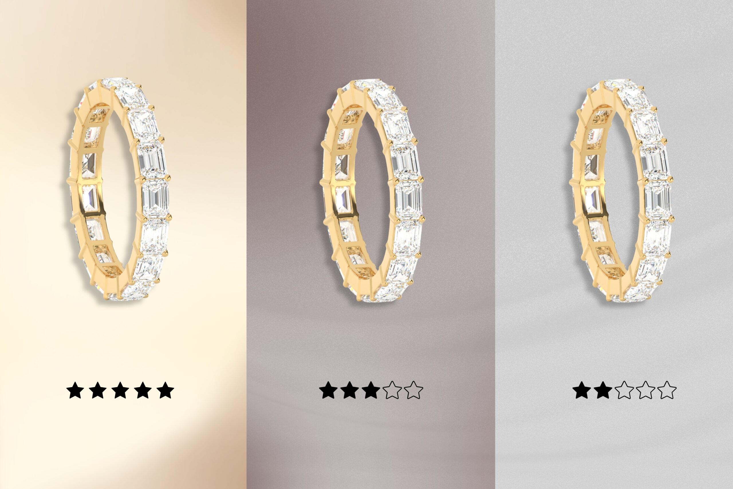
Color Psychology: Choosing the Best Background Color for Jewelry Displays
The jewelry display is a key part of showing off any type of jewelry well, whether it’s just a jewelry 3d rendering or actual photography. This is true whether you are creating product images for online shops or setting up displays in-store. Picking the right background helps bring out the look and fine details of gold, silver, and gemstone pieces. The best background could be a plain white backdrop or a bold, dark shade. A good choice can show off the shine and elegance, making anyone want to look closer. This blog talks about how picking the right background color can help your jewelry stand out, match your brand identity, and attract more potential buyers.
The Power of Color Psychology in Jewelry Displays
Color is more than just decoration—it’s a silent communicator that speaks directly to human emotions. In jewelry retail, the colors used in displays can significantly influence a customer’s mood, perception of value, and ultimately their decision to purchase. This is where color psychology comes into play.
1. Emotional Influence of Color
Each color evokes a specific emotional response. When strategically used in jewelry displays, these colors can enhance the perceived appeal of both the product and the shopping experience.
- Red: Associated with passion, urgency, and desire. Used in moderation, red can create a sense of luxury and excitement, often drawing attention to high-value or statement pieces.
- Blue: Instills trust, calm, and serenity. Blue backgrounds are often used in high-end displays to make diamonds or silver jewelry feel even more elegant and timeless.
- Black: Symbolizes sophistication, power, and exclusivity. Black velvet or matte display cases are commonly used for luxury items to emphasize rarity and class.
- White: Clean, pure, and neutral. White can make colorful gemstones pop and is widely used to convey simplicity and modern design.
- Gold and Warm Tones: Elicit warmth, wealth, and success. These are ideal for showcasing yellow or rose gold pieces, making the entire display feel rich and opulent.
2. Color Contrast and Focus
The human brain is wired to notice contrast. In jewelry displays, contrasting colors between the backdrop and the piece itself can direct attention precisely where it’s intended.
- Example: A sapphire necklace displayed against a soft beige or light cream background makes the blue gemstone stand out dramatically.
- Dark colors help brighter stones sparkle more vividly, while light colors soften and warm up the overall appearance.
3. Perception of Value and Quality
Studies in consumer psychology show that color can shape perceived value:
- Jewelry displayed with dark or rich-toned backgrounds is often viewed as more expensive or prestigious.
- Cool tones (blues, greys, silvers) imply professionalism and quality.
- Warm tones (earthy reds, oranges) create feelings of comfort and approachability, which can work well for artisanal or handcrafted pieces.
4. Influence on Buying Behavior
Color can also subtly nudge a buyer toward action:
- Red and gold are used to stimulate impulse buying.
- Blue and green encourage lingering and thoughtful browsing, ideal for high-involvement purchases like engagement rings.
- Neutral tones prevent distraction and place full focus on the jewelry itself.
5. Cultural Associations of Color
Cultural color psychology should also be considered:
- In Western cultures, white symbolizes purity (popular for weddings), while in some Asian cultures, red symbolizes good fortune and happiness.
- Green may suggest eco-consciousness or prosperity depending on the audience.
Colors for Jewelry Branding
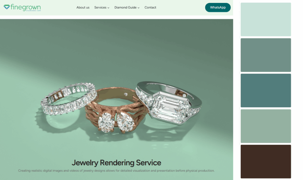
In the luxury and fashion industries, branding is about emotion, recognition, and trust, and color is one of the strongest tools a brand can use to shape these perceptions. For jewelry brands, choosing a single, dominant color palette and using it consistently across all touchpoints—from packaging and logo to website and product displays—is a powerful way to build identity, attract the right audience, and increase memorability.
Understanding the Basics: White, Black, and Gray Backgrounds
White, black, and gray backgrounds are good options for neutral setups in jewelry photography. These backdrops are very flexible, so you can use them for many styles. A white backdrop gives a clean and simple look. It helps you see the fine details in pieces, which is great for things like gold and diamonds. Black, on the other hand, gives a bold and classy look. This makes it perfect for showing off high-end jewelry such as platinum or gemstones.
Gray might not always get noticed, but it sits between strong and calm. It is good when you want to show off smaller pieces without letting anything else take away from them.
White Backgrounds: Offers a clean, bright, and minimalist look, perfect for showcasing the jewelry’s details and making it stand out.
A clean and bright setup lets your jewelry stand out. This helps people see all the unique features without any distractions. When you use a plain white background, it is an excellent choice for jewelry photography. It gives jewelers a neutral canvas that brings out the sparkle of diamonds and the elegance of each piece. This simple look works well with all jewelry types. You can use it to show off gold, silver, or pearl items.
Black Backgrounds: Creates a sense of luxury, sophistication, and drama, making it ideal for high-end jewelry and pieces with intricate details.
Black backgrounds are a great backdrop that makes high-end jewelry stand out. This type of background helps silver jewelry and gemstones to shine, so people notice all the small details. It also makes everything look more about luxury and sophistication. The way black and the jewelry colors work together helps the shine of gold, gemstones, or silver jewelry stand out. This simple but elegant look can make the shopping experience feel more dramatic.
Gray Backgrounds: Provides a neutral and balanced background that doesn’t compete with the jewelry
A gray background is a good pick for jewelry displays. It gives a neutral and balanced look, which helps make any piece stand out. With gray, the focus stays on the jewelry. It does not draw away attention like white or black can. This choice lets your silver jewelry and smaller gemstones show their fine details.
Gray is very useful for your product images, especially for e-commerce sites like Amazon and Etsy. Its soft color lifts the elegance of the jewelry without being too bold. The background makes it easy to see each piece, so people know what they are looking at.
The gray background also matches many colors and finishes. This helps when you want to keep consistency across different product images. Whether you use it for your best photos or digital renderings, gray adds just the right style. It brings out the sophistication in any jewelry and suits many types.
Choosing the Best Background Color for Jewelry Displays: Stone and Metal Colors
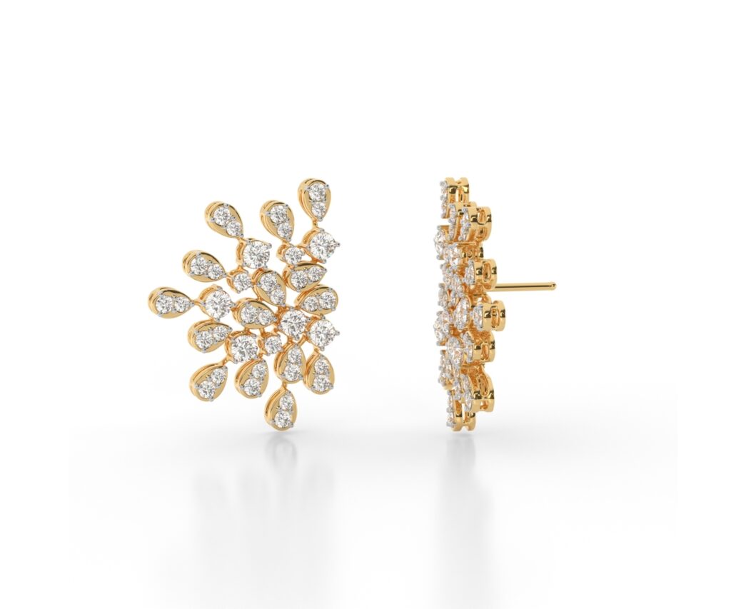
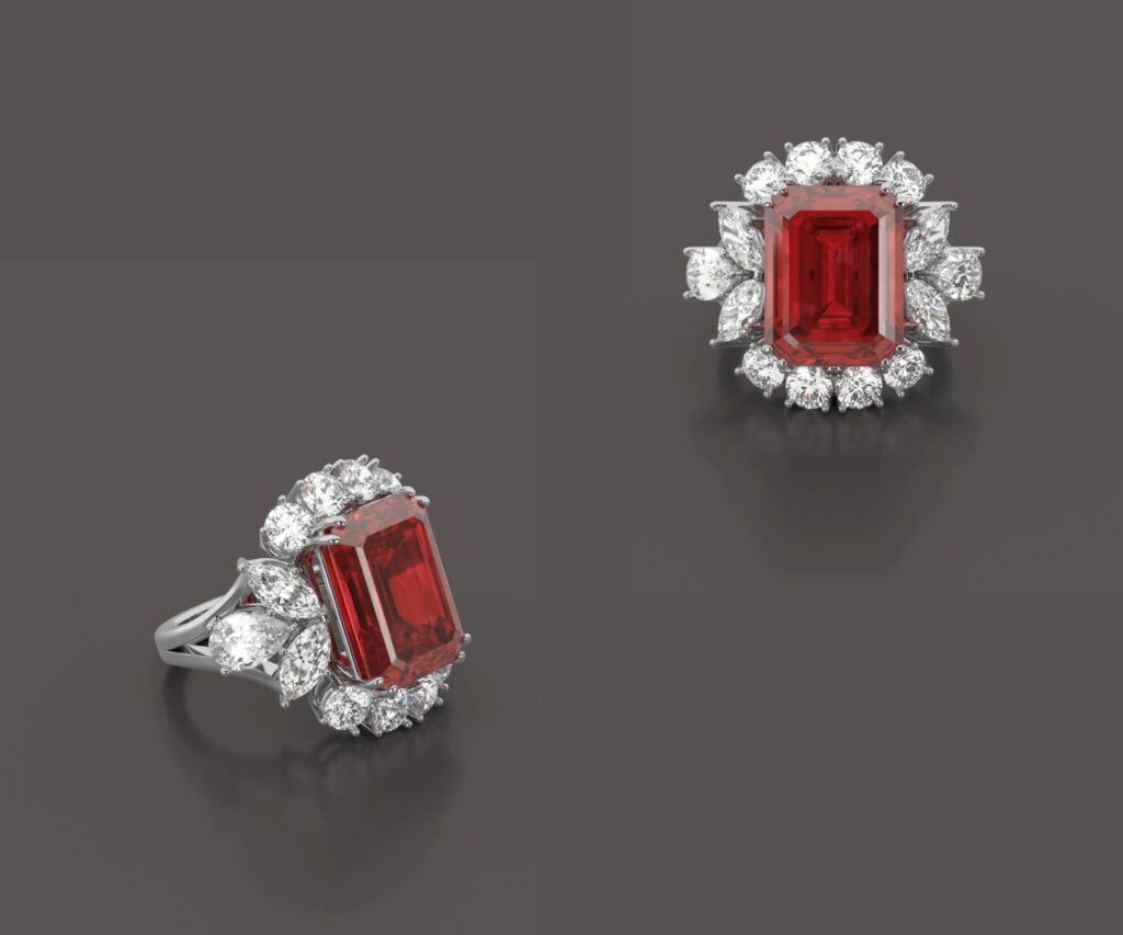
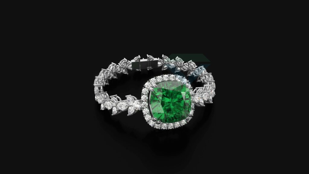
Matching the best background to the jewelry type is very important for great product photos and displays. Gold jewelry, silver jewelry, and gemstones all need backgrounds that make them stand out. With the right setting, you can show their beauty and skill.
For gold jewelry, try warmer colors or a plain white background. These make gold look brighter and richer. Silver jewelry looks best on gray backgrounds. This is the best background for showing off silver’s shine. If you take photos of vibrant gemstones, black is one of the best colors to use behind them. The dark color makes gemstones pop.
Let’s look at the best colors for each jewelry type. You can also mix these ideas in creative ways to help your jewelry stand out.
Best Colors for Gold, Silver, and Gemstone Jewelry
When you want to show off jewelry in the best way, you have to pick the right background colors. This is very important. Here is a look at the best background for each jewelry type:
| Jewelry Type | Best Background Colors |
|---|---|
| Gold Jewelry | White, Beige, and Pastels for warm elegance |
| Silver Jewelry | Gray, Black for depth and subtlety |
| Gemstone Jewelry | Black, dark green, to highlight sparkle, and White for vibrance |
Tips for Mixing and Matching Backgrounds with Jewelry Styles
Blending different colors with jewelry styles can help you make product images that stand out. This is both an art and a way to show your brand’s identity. Here are some tips:
- Start Consistent: Pick colors that match well for pack shots. This keeps your branding uniform.
- Experiment: Try out different colors to see what fits best with jewelry styles like pearls or gemstones.
- Use Props Wisely: Use props made of velvet or marble to make luxury jewelry look even better.
- Gradients for Elegance: Choose a gradient background to give some depth but still keep the product in focus.
To keep your brand identity strong, be consistent with how your product images look. Using props like textured backgrounds or velvet can help you showcase each jewelry style the right way. Pick colors that go with the type of metal or stones in the jewelry, but always keep the whole photo looking smooth and put together. This will give the most impact and show off the elegance of your designs.
Practical Display Tips for Retail, Photography, and Digital Showcasing
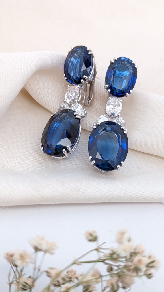
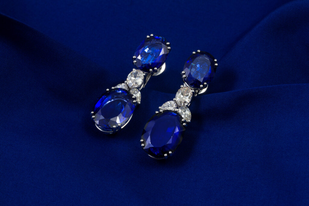
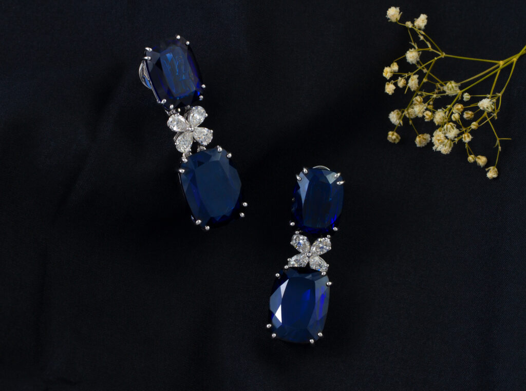
To boost jewelry sales, simple steps bring together in-store and online ways to show your items. In the store, use mannequins and nice displays. This helps people see how the jewelry will look on them. When doing jewelry photography, it is best to use good lighting, choose strong camera angles, and have a clean background and clean props. This makes your pictures great for any product page or store online.
When showing off items online, like on social media, it helps to focus on the details of each piece. Use clear, edited images that show off the sparkle of the jewelry. Now, let’s talk about how the right setup, better lighting, and good camera tricks can make displays, both in the store and online, look even better.
Optimizing Lighting and Angles for Maximum Visual Impact
Good lighting can help show off jewelry and make it look more sparkly, which is what many potential buyers look for. Using natural light or soft LED lights makes the jewelry shine without hard shadows. This helps to show all the small details in each piece.
It is also important in jewelry photography to play with the angles. Taking photos from different sides lets shoppers see the quality and skill that went into the jewelry. By using the right lighting and taking pictures from several angles, you can get product images that grab the eye and fit your brand identity. In the end, this will bring in more online conversions and help your business.
Common Mistakes to Avoid When Selecting Display Colors
Choosing the right display and backdrop colors is important when you show your jewelry. The colors you pick can make your pieces look better or worse. One big mistake is using backgrounds that are too bright or bold. These can take away from the elegance of your jewelry and confuse potential buyers. It is also important to think about the type of jewelry you are showing. Gold jewelry and silver jewelry usually look best on neutral backgrounds. If you show gemstones, you may want to use softer hues so the colors do not fight with the jewelry. The setup of your display should also show consistency in color. If you mix too many colors, it can take away from your brand identity and make it hard for people to know what is special about your jewelry.
Leveraging Digital Rendering for Unlimited Display Experimentation
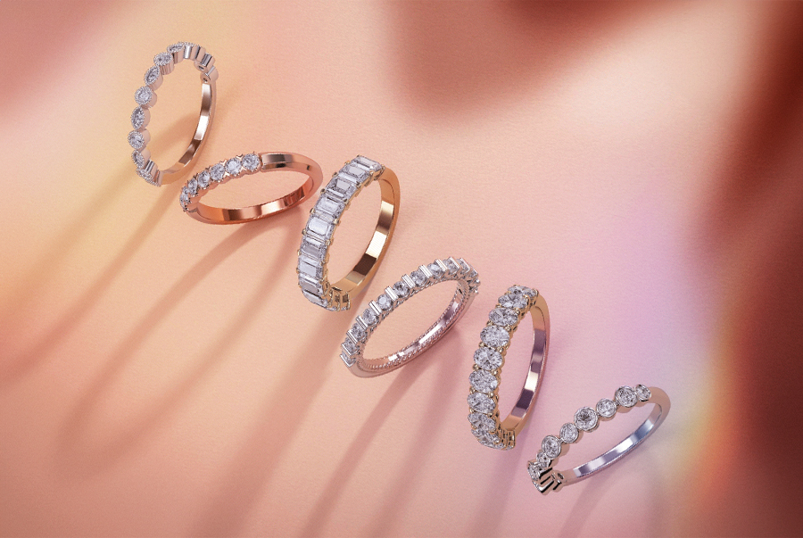
Visual experimentation with digital rendering gives jewelers more options for jewelry displays. When you use CGI tools, you can try out different backgrounds and settings. This helps you see how different colors change the look of a piece and its shine or elegance.
This way, you make jewelry photography better and can adjust product images right away. This helps to get more attention from potential buyers. Using these digital methods keeps your brand identity strong. It also helps you show jewelry looking its best. As a result, online sales and conversions can go up.
Advantages of Digital Jewelry Rendering Over Traditional Setups
Using digital jewelry rendering helps show each type of jewelry in the best way. With this method, you can pick backgrounds and lighting that fit the piece, like silver earrings or gold necklaces. You are not limited by what props you have or where you take the photos. This lets you try different colors and looks until everything is right. You can also change the pictures easily, so they match your brand identity well. All of this helps online conversions and gives people a better shopping experience.
How to Use Digital Tools to Test and Find the Best Background Color for Jewelry Displays
Testing and finding the right background color is a lot easier with digital tools. The use of software lets jewelers try out different styles like plain white, black, and gradient backgrounds. You get to see all these choices right away. This helps you know how each color can make the jewelry shine or change how it looks. By using image editing, potential buyers can look at the jewelry in real-life ways. This makes the shopping experience better for people and helps keep up with the brand identity. All of this helps the pictures stand out and can lead to more online conversions.
Conclusion
Choosing the right display background is important for showing off the beauty of different types of jewelry. Jewelers who use color in smart ways can make the shopping experience better for their customers. The right colors can help make the jewelry look like it sparkles more. These background choices also help the jewelry match the brand identity. Some people might like a simple background, while others want something bold. Both styles can help product images stand out and lead to more online conversions. Taking time to plan your jewelry displays will bring in more potential buyers and help your merchandise look its best.
FAQs
What is the best background color for showcasing diamond jewelry?
The best background for showing diamond jewelry is usually black or dark blue. These colors make the diamonds shine and sparkle more. They give a strong contrast, so the gems look clear and have sharp cuts. This helps people notice all the beauty in the diamonds.
Can colorful backgrounds ever work for jewelry displays?
Colorful backgrounds can make jewelry displays look bright and full of life. The key is to pick a background that matches the jewelry. This helps show off the color and style of each piece without taking away from them. When you choose the right pair, it can create a look that stands out and gets people to notice.
How do digital renderings help reduce display costs?
Digital renderings help cut back on the need for real samples and materials, so the expenses are a lot less. You can use them to try out many designs and backgrounds as much as you want. There is no need to spend extra money. This makes the setup of your display easier and faster, but the look of your jewelry will still be top-quality.
Is there a universal background color for all types of jewelry?
There is not one background color that fits every jewelry type, but neutral shades like white or black are usually good choices. The color you pick should fit the piece’s design and what you want people to feel or see. These colors help create clear contrasts and can make jewelry stand out more.
How can I quickly test different backgrounds for my jewelry online?
To quickly try out different backgrounds for your jewelry online, you can use a digital rendering service with our finegrown diamonds jewelry rendering service. These let you see your images and play with a range of colors and textures. This way, you see how each background can help or hurt how your jewelry looks. It is an easy way to know what works best for your piece.

